Issues 23 to 26 of the critical review dedicated to graphic design.
#23 — A portrait:
The Master approving of his own work.
Author: Ziga Testen
Design history as an independent discipline and field of study appears to be in trouble. Design historians complain about its diminishing influence within universities due to the ongoing instrumentalisation of higher education. The Eurocentric canon built upon values and methods adopted from art and architecture history has been contested by decolonial theories. And finally, it appears that the trust in the institution of "history" itself and its meta-narratives has eroded.
A discipline that was once considered to provide reflection on what came before and guidance on what could come to be—under the auspice
of a grand narrative of continuous progress—has been replaced by modest narratives, social anthropologies, and claims of the "end of history".
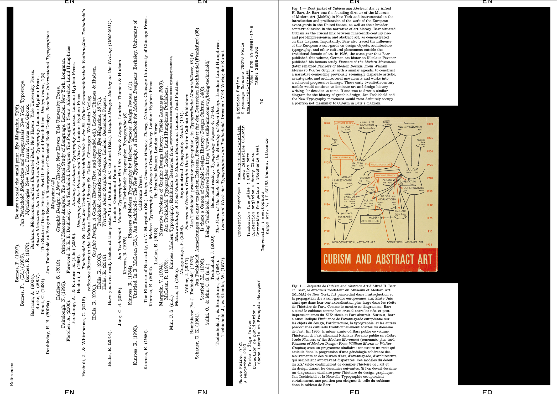
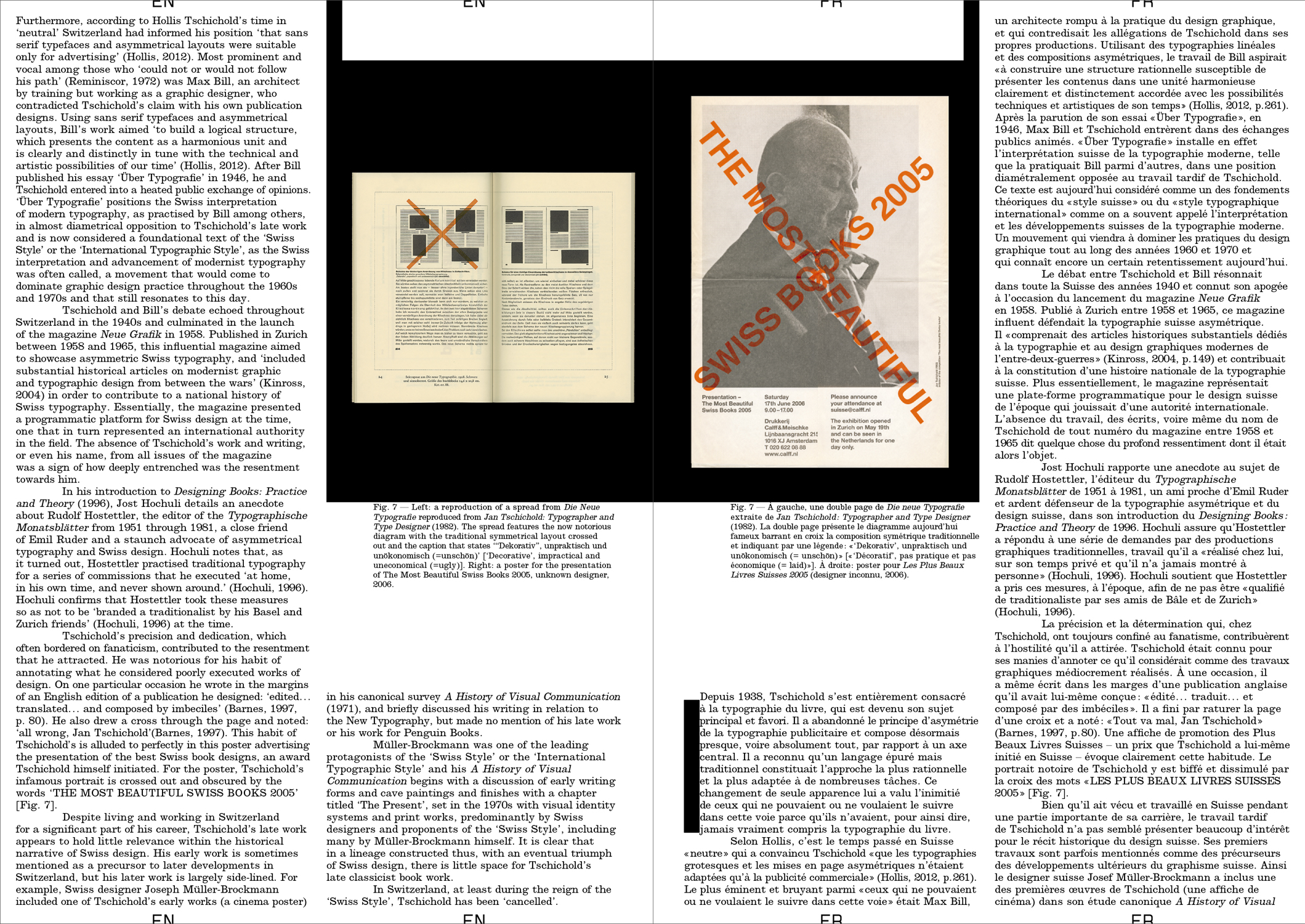
In this article, I rummage through the ruins of design history and try to unpack what it was that we once considered design history and our design history canon, how we wrote about it and to what end. In particular, I focus on this one image: a portrait photograph of a well-known historical figure, the designer and typographer Jan Tschichold. How is it used? And what stories do we tell about it?
#24 — A theater identity:
The Schauspielhaus by Cornel Windlin.
Authors: Étienne Hervy and
Thierry Chancogne
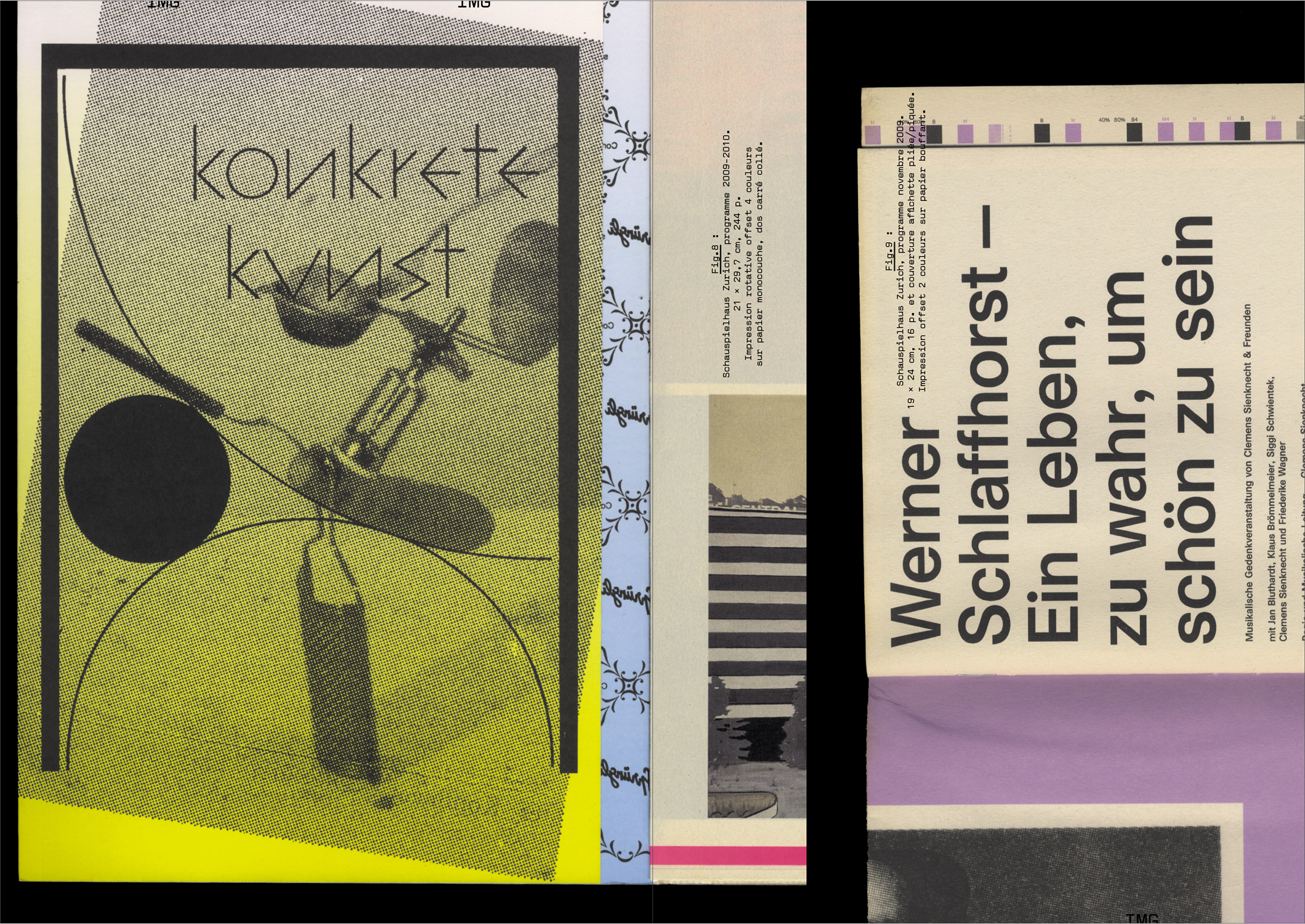
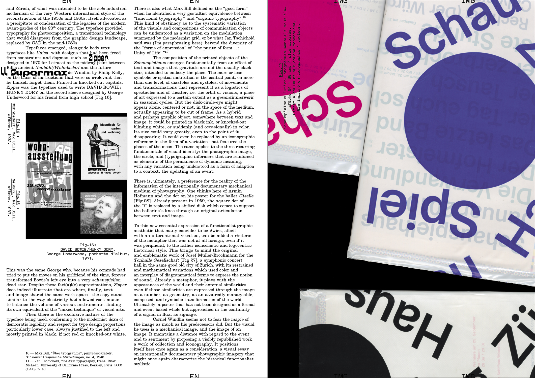
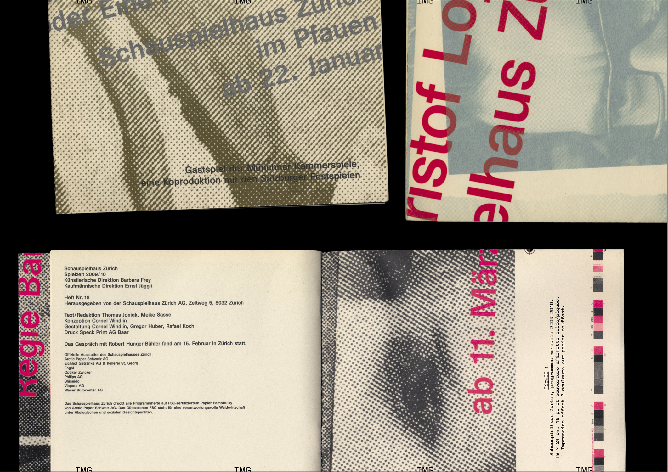
Designed by Cornel Windlin (with Gregor Huber), the communications of the Zürich Schauspielhaus for the 2009/10 and 2010/11 seasons appeared just as the collaboration between the designers and the theater ended: with the Grand Prix of the Brno Biennial in 2010, where they won first prize in the international competition, with an exhibition in Chaumont the following year at the same time as the Swiss Federal Design Award, a brief appearance in specialist magazines and on specialist sites, and then nothing at all. Once again, Cornel Windlin retreated into the shadows, leaving behind work which asserted itself through both its amplitude and completeness in the heavy silence which remained, and through the multifaceted mass of the media imagery that it reactivated. A series of seasonal posters, event posters, annual and monthly programs, booklets dedicated to each piece, invitations, flyers, graphic materials from the program for younger audiences… everything is here, set in a precisely tuned bold Unica77, digitized by the Lineto foundry with the original team of designers (along with Windlin), all coming together in that blindness inherent to times of eclipse, where the black disk chosen by Windlin as the identity of the Schauspielhaus stands out. Now, a decade later, the idea is to propose a meticulously organized reception, informed by Cornel Widlin and placed in a cavalier perspective by the analysis of Thierry Chancogne.
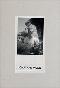
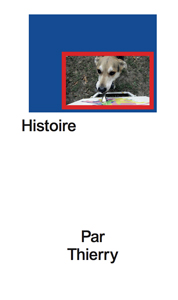
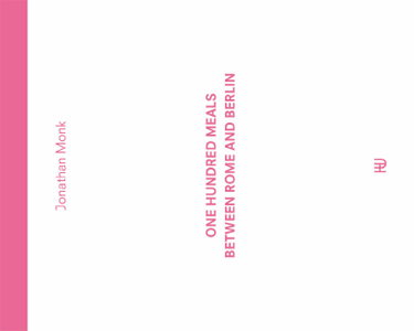
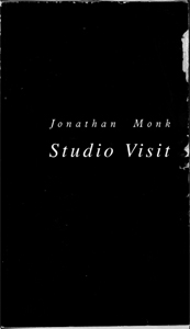
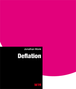
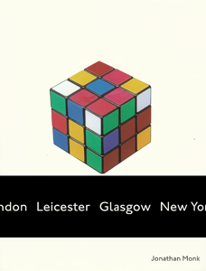
#25 — Exhibition views?:
Jonathan Monk.
Author: Remi Parcollet
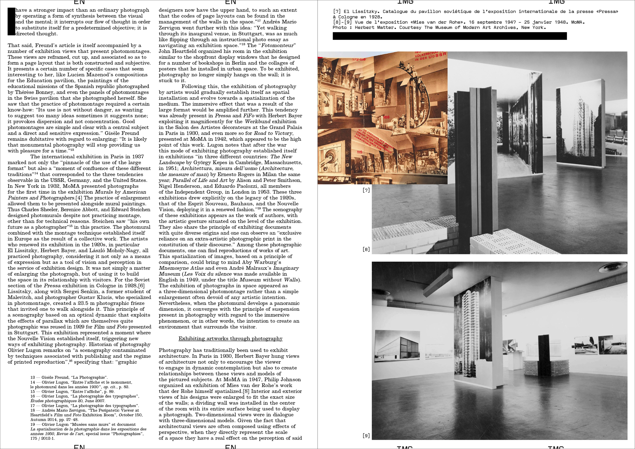
Photographs of works of art in an exhibition or studio setting, enlarged to the size of the wall, have become an essential and increasingly systematic element of contemporary museography. The institutional curator accompanied by his or her set designer, and the independent curator, both use them as much to recontextualize works as for their aesthetic qualities as documentary images that have become immersive and reflexive.
The obviously richer relationship that artists have with these unique images reveals in various ways what is currently at stake in the act of exhibiting.
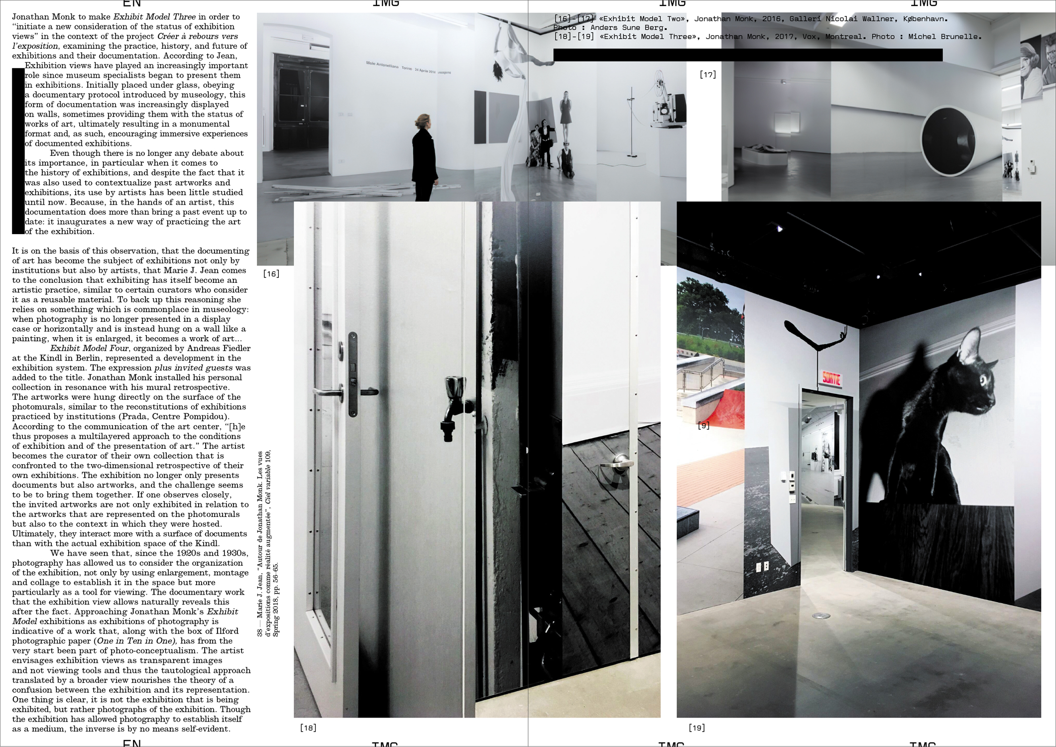
To create a kind of retrospective of his work, in 2016 Johnathan Monk debuted a series of exhibitions entitled Exhibit Model, which consisted of covering the walls of the exhibition space with archive photographs that documented his work in different contexts over the last 20 years. Marie J. Jean considers these staged exhibition views as a form of augmented reality: "This manner of considering the exhibition, in other words, of exhibiting the work along with the context of its appearance, reminds us that the work of art 'is a place', 'establishes a place', is 'a to-take-place'."
However for Johnathan Monk, who often uses the work of other artists, isn't it simply a way in which to appropriate his own work?"
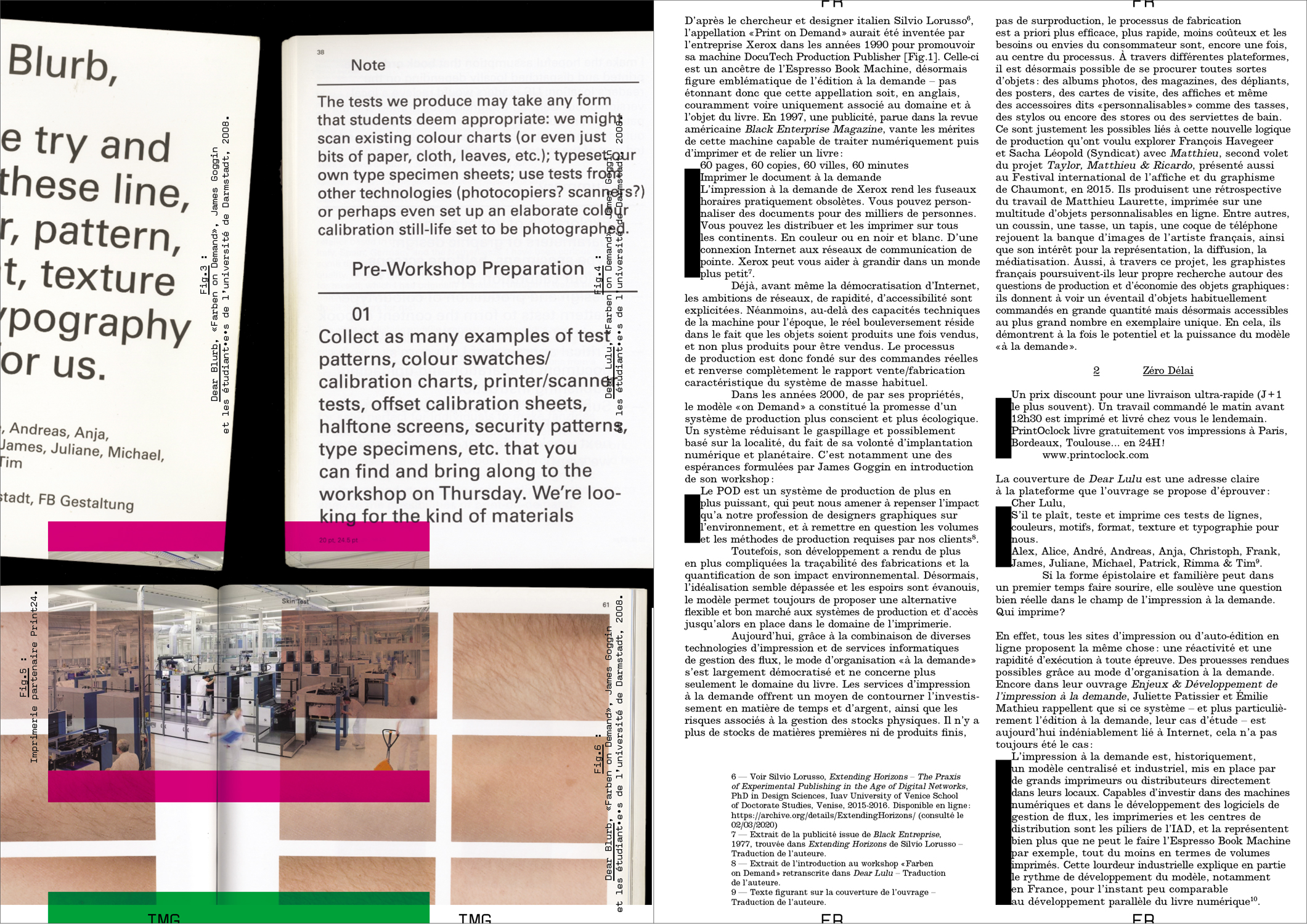
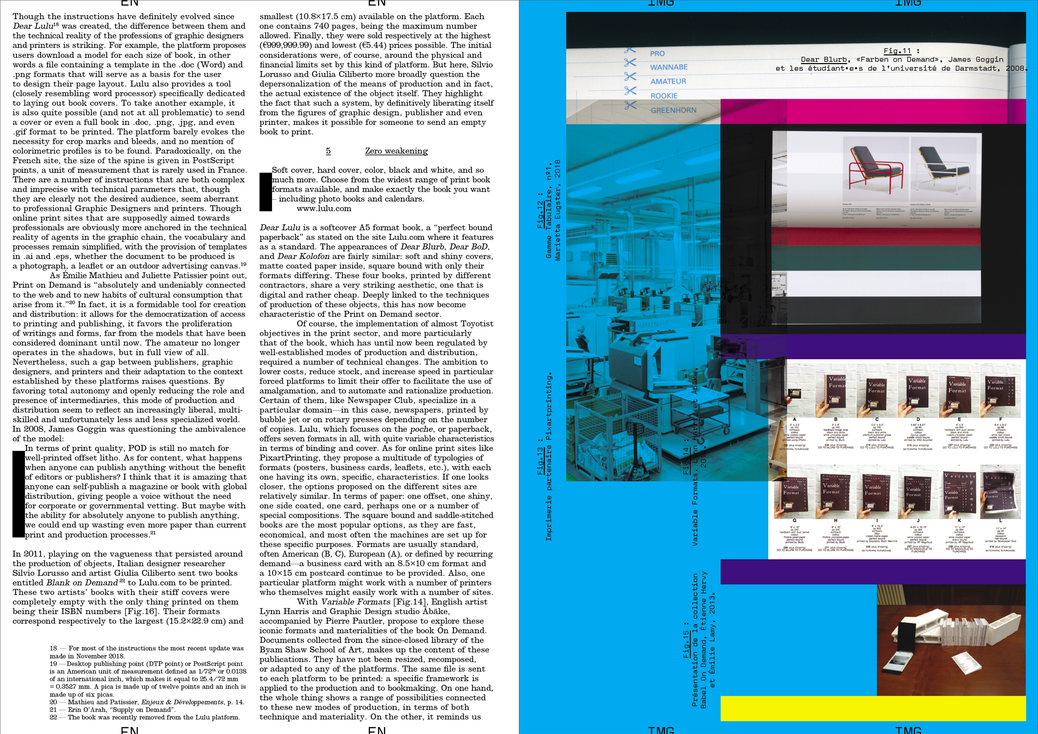
#26 — A system of production: Print on Demand.
Author: Manon Bruet
In 2008, English Graphic Designer James Goggin ran a two-day workshop with design students at the Hochschule Darmstadt in Germany. The object which resulted gradually took on the appearance of a photo album, a typeface specimen, and a color chart. On the cover, the phrase "Dear Lulu, Please try and print these line, color, pattern, format, texture and typography tests for us" is clearly addressed to the online print platform for which this book was proposed as a test.
Ten years later, the offer has become more diverse and the success of such online platforms is undeniable—indeed the phenomenon has spread well beyond the field of publishing. While some bemoan unfair competition for printers, others, professionals and amateurs, see in it a freedom to print and distribute relatively well finished objects at low cost.
The possibilities of these systems of production are multiple but nonetheless limited, and this obviously raises the question of a possible standardization of forms and formats. However, when it comes to Print On Demand, it seems that the issue is not so much the materiality of an object (the choice of format, paper or a particular manufacture) but rather the actual existence of this object itself, outside of usual channels of production and distribution.
Faire is a bi-monthly magazine dedicated to
graphic design, published from October to June, distributed issue by issue or in the form of anthologies of three or four issues. Created by
Empire,
Syndicat studio's publishing house,
Faire is aimed for undergraduate students as well as researchers and professionals, documenting contemporary and international practices of graphic design, along with the history and grammar of styles. Each issue focuses on a single subject, addressed by a renowned author. Adopting an analytical and critical posture with regard to the forms and activities of graphic design, editors Sacha Léopold and François Havegeer have been running this print magazine since 2018, working with a growing list of authors (
Mathias Augustyniak,
Stuart Bertolotti-Bailey, Lise Brosseau, Manon Bruet,
Thierry Chancogne, Céline Chazalviel,
Jérôme Dupeyrat, Aude Fellay, Catherine Guiral, Étienne Hervy, James Langdon, Olivier Lebrun, Victoire Le Bars,
Alexandra Midal, Camille Pageard,
Remi Parcollet,
Sonia de Puineuf, Simon Renaud, Benjamin Thorel, Rica Cerbarano...), resulting in unique and varied topics and writing styles.