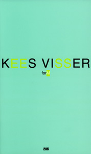
Text by Jérôme Poggi
(excerpt, p. 18-20)
© Analogues, the author
“[Dream-work] does not think, calculate or judge at all, but limits itself to transformation.”
Sigmund Freud, The Interpretation of Dreams (1900), New York, Macmillan, 1913.
“The eternal mystery of the world is its intelligibility.”
Albert Einstein, “Physics and Reality”, Journal of the Franklin Institute, Volume 221, Issue 3, 1936.
“Logic precedes every experience—that something is so.”
Ludwig Wittgenstein, Tractatus logico-philosophicus (1918), 5.552.
Kees Visser invites us to take a retrospective view of his work in reverse, starting with his most
recent work, which he created precisely in response to the Musée Matisse's invitation to revisit
nearly forty years of his artistic career. Leaving the art historian the task of placing his works and
their history in perspective, Kees Visser first reacted as a painter to this retrospective project,
above all favouring an introspective approach. He therefore created three monochrome paintings
— in red, blue and green — forming a triptych, each one designated
by three letters that in turn give the work its title:
FEW.
The formats are large and the proportions unusual (132 x 220 cm),
on the scale of the artist painting these large sheets of laminated
paper with his arm outstretched, placed horizontally on a work
table. Unlike Vitruvian man fitted within a circle, the artist moves
around the table, his hand filled with paint applying the colour
and the repetitive gesture in these large, slightly sloping, rectangular
forms so characteristic of his work. Beyond their apparent
monochrome radicalness and the minimalism of their form, the
depths of these vast surfaces of colours contain something quite
different. Of course, if not a conceptual artist, Kees Visser is at
least systematic, having developed over the past seventeen years
a rigorous method to strictly determine the combinations of forms
and colours used in his paintings. Compiled in a catalogue raisonné
which he has kept up-to-date since 1992, each series of
thirty-two forms is given the title of a letter of the alphabet. F, E
and W thus designate the three series from which the borrowed
forms originate: the blue and red paints belong to the series E
and F respectively (series created in 2002-2003), whilst the green
paint is the first in the W series, which Kees Visser created specifically
for this project. So much for the method. But beyond this
strict, rigorous structure, the artist exercises a freedom he has
found within the same logical system of his own making. And it
is here that Kees Visser immerses himself entirely in a sensitive
and intuitive experience of painting. We have to look at
FEW with our eyes, more than with our
minds, and see in this triptych not only three primary colours answering each other in rectangles,
but instead three figures — both in the literal and “figurative” sense — standing alongside one
another, singular and isolated in their white, parallel but slightly slanted margins, attracting or
retracting from one another, blending in the spectator's eye and in the large white paintings that
the artist has placed in between them. More than geometric figures or stylistic devices, these
paintings embody figureheads, with faces rather than images hidden behind them… We should
not be afraid to consider Kees Visser's work subjectively. He even encourages us to do so, for
example by giving his most recent artist's book the title
forM, playing on words and with the
reader's imagination, placed in the secret of a revealed intentionality. The artist's work sometimes
takes the form more of a tribute than a rectangle. This is the case with
FEW, which behind
these three letters hides a tribute to three figures from the 20th century: Freud, Einstein and
Wittgenstein. Red, blue and green. From the logic of the first to the irrationality of the second,
via the relativism of the third, these references speak of the complex intellectual heritage that
has nurtured Kees Visser. Language and logic are central to his project, but the physicality of
objects along with their sensitive and emotive interpretation also form constituent parts of his
work, as nuanced as the colours which depict it. Einstein's blue is therefore the mixture of an ultramarine tending precisely towards the red and a slightly green cyan, both colours are tempered
in equal proportions to obtain this blue which is both sombre and striking. Wittgenstein's green
is the “highly strange mixture” of a Nickel Azo yellow with surprising densitometric properties
— passing from a luminous yellow to a deep ochre when added to itself — and a manganese, very
blue, almost turquoise green. Although the red is assigned to the figure of Freud, it is less passionate
than it appears behind its dominant deep Cadmium red, to which carmine and quinacridone
violet have been added.
Such is Kees Visser's work, constructed in nuances over the past forty years, crossing references,
confusing our bearings and conducting numerous experiments. He has followed a unique line, far
removed from the artistic schools and movements which he nonetheless attentively observed.
(...)